
A Visualizer is a publishable dashboard page built from one or more views — each a chart, a big-number KPI, a table, or a raw JSON feed over the same stream of rows. It's an App-owned artifact like everything else in FlowFn, and it has one defining trait worth understanding up front: a Visualizer doesn't read your database — a workflow pushes rows into it. That inversion is the whole trick. Instead of a dashboard that polls a table and needs read credentials, you have a design-time object that other automation feeds, and a public page that renders whatever's arrived.
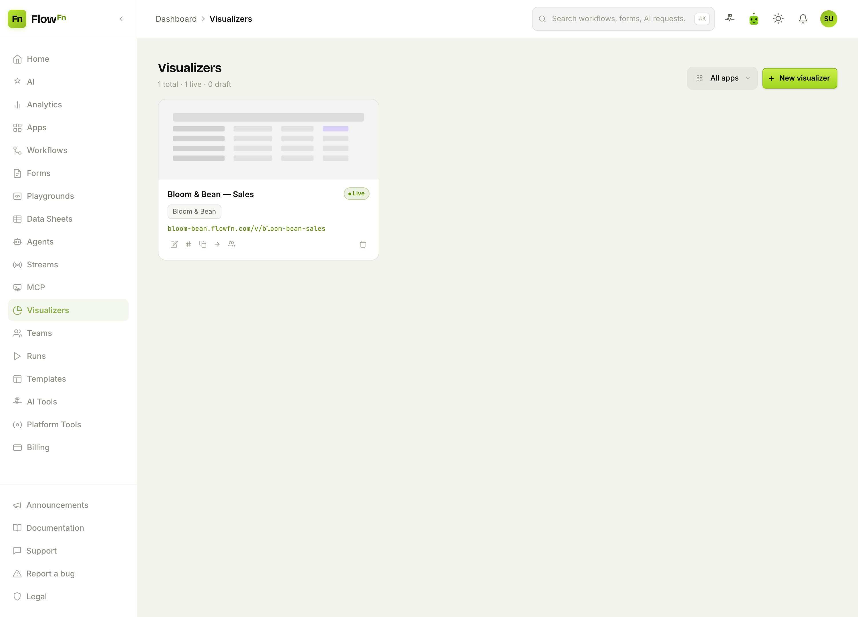
We'll build Bloom & Bean — Sales, a live dashboard for the café whose Data Sheets we set up earlier. Every time an order lands, the café's order workflow does two things: it writes the row to the orders sheet, and it pushes a copy into this visualizer. Here's where we're headed — the live public page:
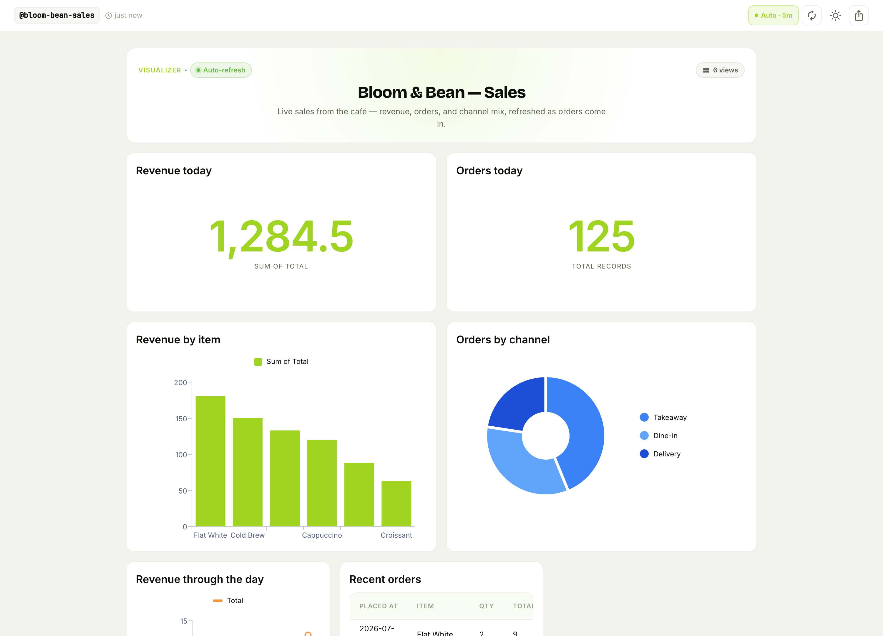
Two KPI cards, a revenue-by-item bar chart, an orders-by-channel donut, a revenue-through-the-day area chart, and a recent-orders table — all on one auto-refreshing URL anyone can open. Let's build it.
Step 1 — Create a visualizer
From Visualizers, hit New visualizer. Name it, give it a slug (that becomes its public /v/<slug> URL), pick the App, and choose whether it starts public.
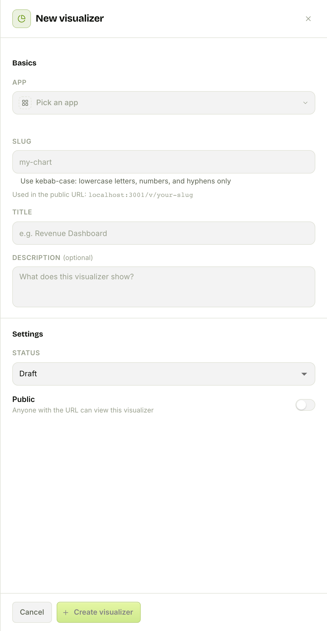
A fresh visualizer starts with an empty schema and a single table view. The two things we shape next are its fields (what a row looks like) and its views (how to show them).
Step 2 — Design the board
The editor has three tabs — Board, Preview, Data — and the Board is where you compose the dashboard.
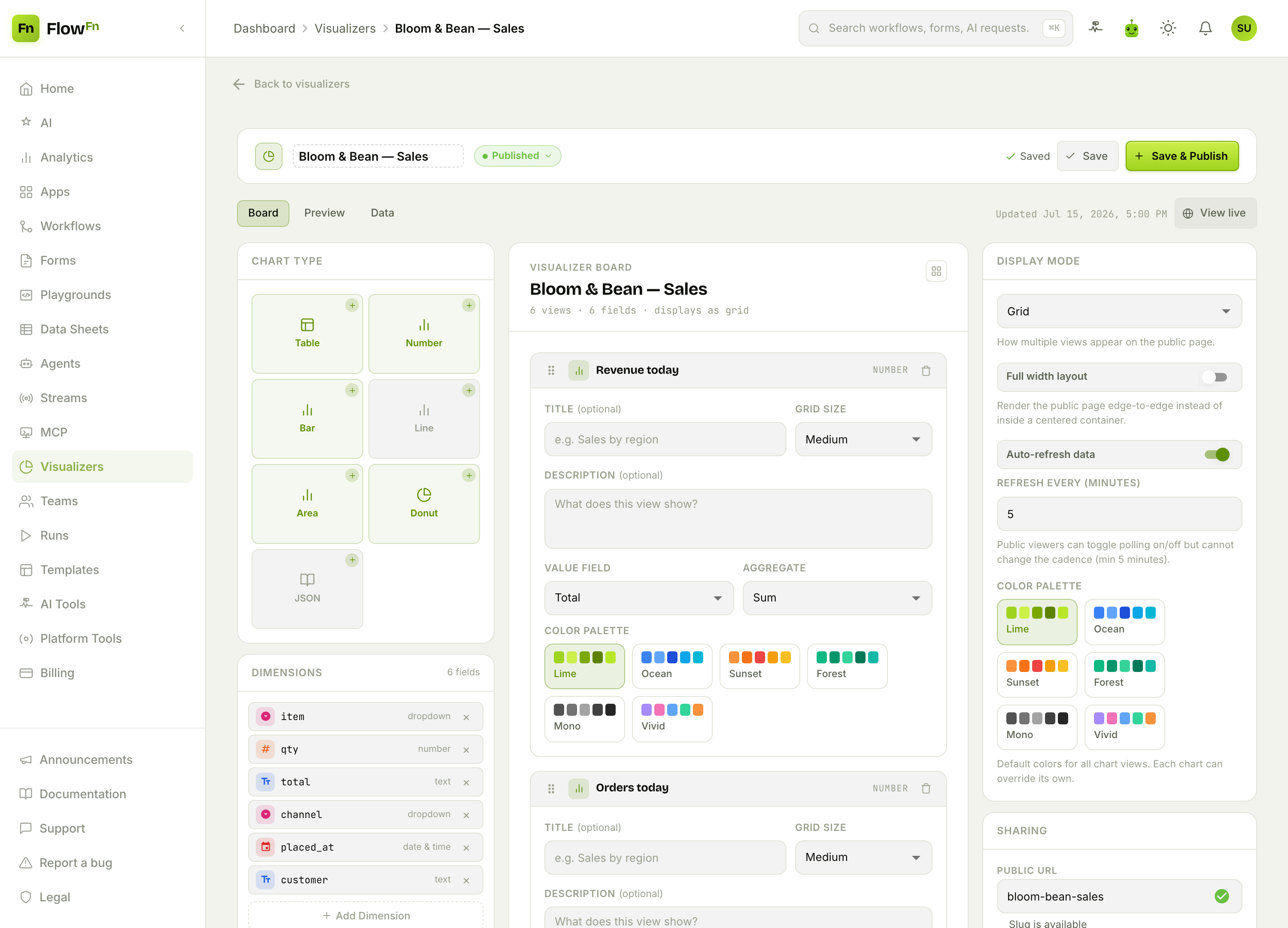
Three panels, left to right:
Chart Type — click to add a view. There are seven:
| View | What it's for |
|---|---|
| Table | paginated raw rows, pick your columns |
| Number | a single big-number KPI (a count, sum, or avg) |
| Bar | a value aggregated across a category |
| Line / Area | a series over time (area is a line with fill) |
| Donut | share of a whole, by category |
| JSON | the raw feed, pretty-printed |
Dimensions — the fields a row carries (item, qty, total, channel, placed_at, customer), each typed. These are the keys your charts bind to.
Each view's config — every chart maps a couple of fields to what it draws:
- Charts (bar/line/area/donut) take an X axis (the category or time field) and a Y axis (the value), plus an Aggregate:
Count,Sum,Avg, orValue. Our Revenue by item bar isX = item,Y = total,Sum. - Number cards skip the X axis — the whole filtered set reduces to one figure. Revenue today is
Sumoftotal; Orders today is a plainCount. - Tables just pick their columns and a sort.
On the right, Display Mode controls how the views lay out on the public page (Tabs, Grid, or Pages), the page-level color palette (Lime, Ocean, Sunset, Forest, Mono, Vivid — each view can override), and auto-refresh (more on that below). Below it, Sharing owns the public URL, password, and SEO.
Step 3 — Preview without a backend
The Preview tab renders your board against sample data, right in the editor — no need to wire up a workflow first:
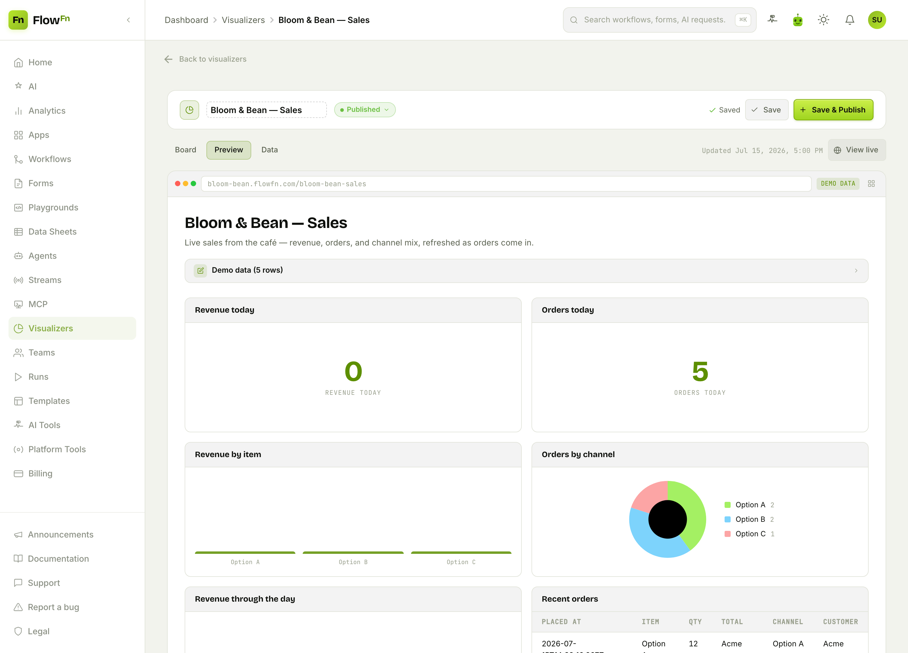
It's a browser-framed mock with a DEMO DATA badge and an editable Demo data panel — tweak the JSON and watch the layout react. Use it to get your views and grid sizes right before a single real row exists. (Preview uses generic placeholder rows; the real charts, with your data, live on the public page.)
Step 4 — Feed it from a workflow
Here's the part that makes a Visualizer a live dashboard instead of a static one. Data arrives through the data_visualizer task in a workflow: the task takes its resolved inputs and writes them as one row on the visualizer (each field you've declared in the schema is coerced to its type — "12.50" becomes a number, a date string becomes a date — and anything extra passes through). So the café's order workflow ends with a Data Visualizer task pointed at Bloom & Bean — Sales, mapping item, qty, total, channel, and placed_at. Every order that flows through the workflow lands here.
The Data tab is your audit trail of everything that's been pushed:
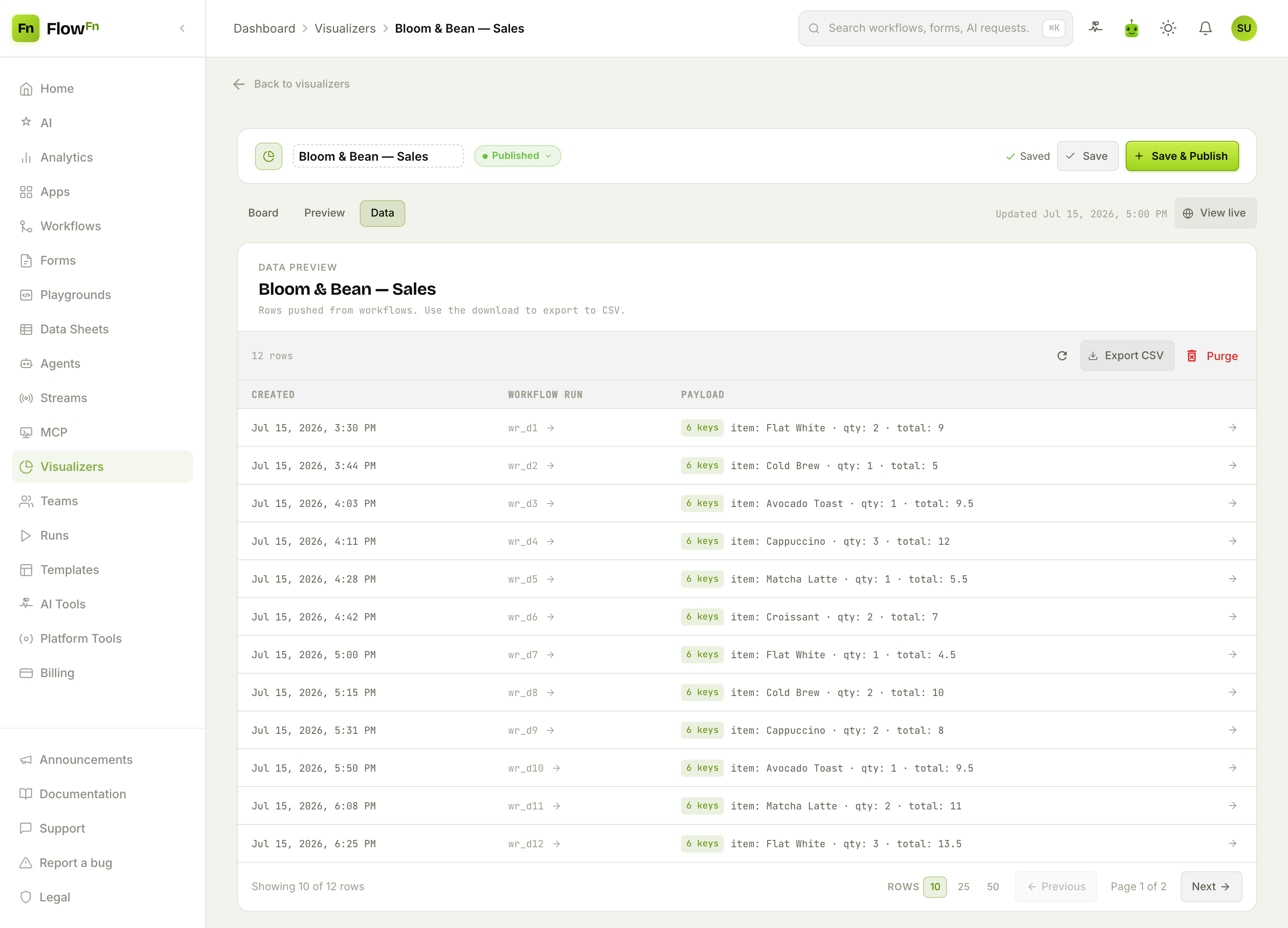
Each row shows when it arrived, which workflow run produced it, and its payload. You can Export CSV or Purge old rows. Agents can feed a dashboard too — an agent's visualizer binding pushes rows the same way. (Rows only ever arrive from a workflow task or an agent binding; there's no public "ingest" endpoint to POST to.)
Why push, not pull? Because the thing that knows an order happened — the workflow — is already running. Emitting a dashboard row from it is one extra task, with no second system reading your database on a timer and no read credentials to hand out.
Step 5 — Publish, embed, refresh
Flip the visualizer to public and it's live at /v/<slug> on your App's host. Two more knobs matter:
Embed — drop the dashboard into any site as an iframe:
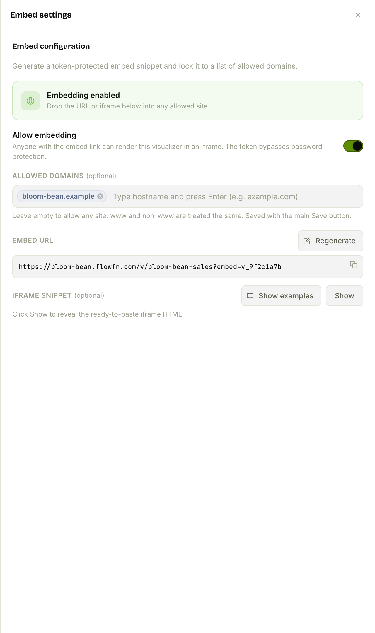
You get a token-protected embed URL, an optional allowed-domains allow-list, and a Regenerate button that rotates the token if a link leaks. (The embed token bypasses password protection — that's what lets it render on your marketing site without a login — so rotate it, don't share it.)
Auto-refresh — turn it on and the public page re-fetches on a cadence (minimum five minutes). Visitors can pause polling for their session but can't change the interval, so a popular dashboard can't hammer your data. The page also shows a "last updated" stamp and a manual refresh.
Under the hood the public page is smart about how it fetches: bar and donut views ask for a grouped aggregate, number cards ask for a single total, and tables/line/area/JSON pull the raw rows. You never think about any of it — you pick a chart type and the right query happens.
Filters, palettes, and the finishing touches
- Filters scope the whole dashboard:
equals,not equals, the comparisons, andcontains. Mark a filter overridable and visitors can drive it from the URL (?filter_channel=Delivery) — handy for one dashboard that serves many slices. - Palettes cascade: a per-view color beats the page default beats the platform default, so you can theme the whole board in one click or fine-tune a single chart.
- SEO gives the public page a real title/description for search and link previews (plan-gated, and only when the page is openly public).
Plan limits
Visualizers are plan-gated: whether the feature is on (allow_visualizers), how many you can create, and whether embedding and SEO are available. Go over your count on a downgrade and the extra dashboards go quietly private until you're back under the cap — nothing is deleted.
Wrap-up
Visualizers turn "we should build a dashboard" into an afternoon: define your fields, add the views you want, and let a workflow push rows in. You get real charts, a public and embeddable URL, auto-refresh, and filters — with no BI tool, no warehouse, and no SQL. The data you store, the workflow that processes it, and the dashboard that shows it off are all the same few clicks apart.
Start with one Number card and one Bar chart, open the Preview, then add a data_visualizer task to a workflow and watch the Data tab fill. Next, we'll hand this same data to an external AI — hosting an MCP server so a tool like Claude can query the café directly. Make your data visible, and the story it's telling shows up on its own.