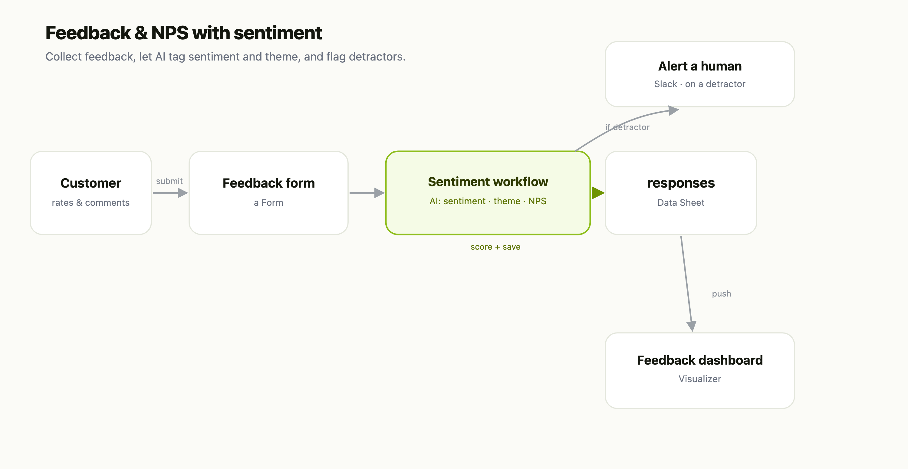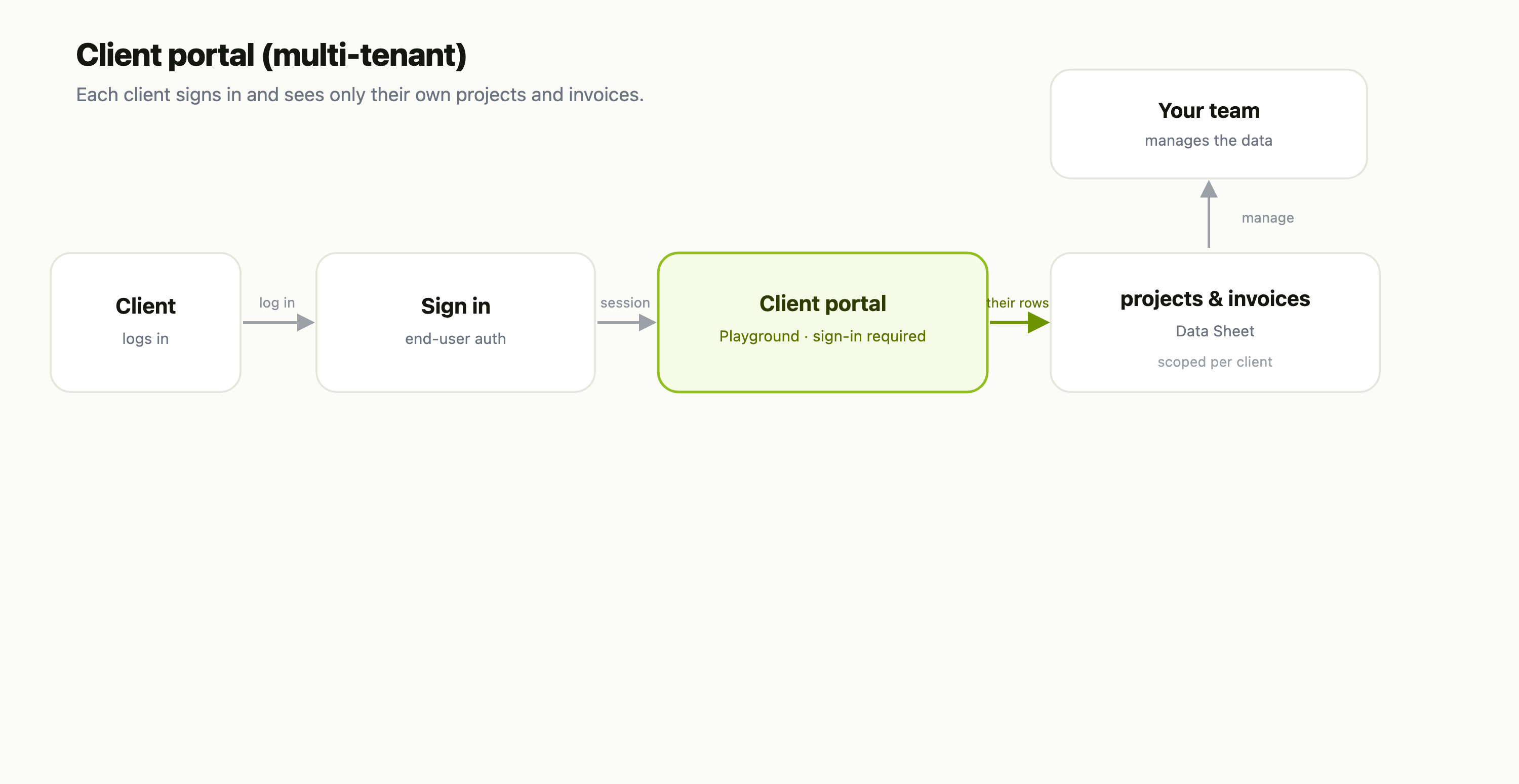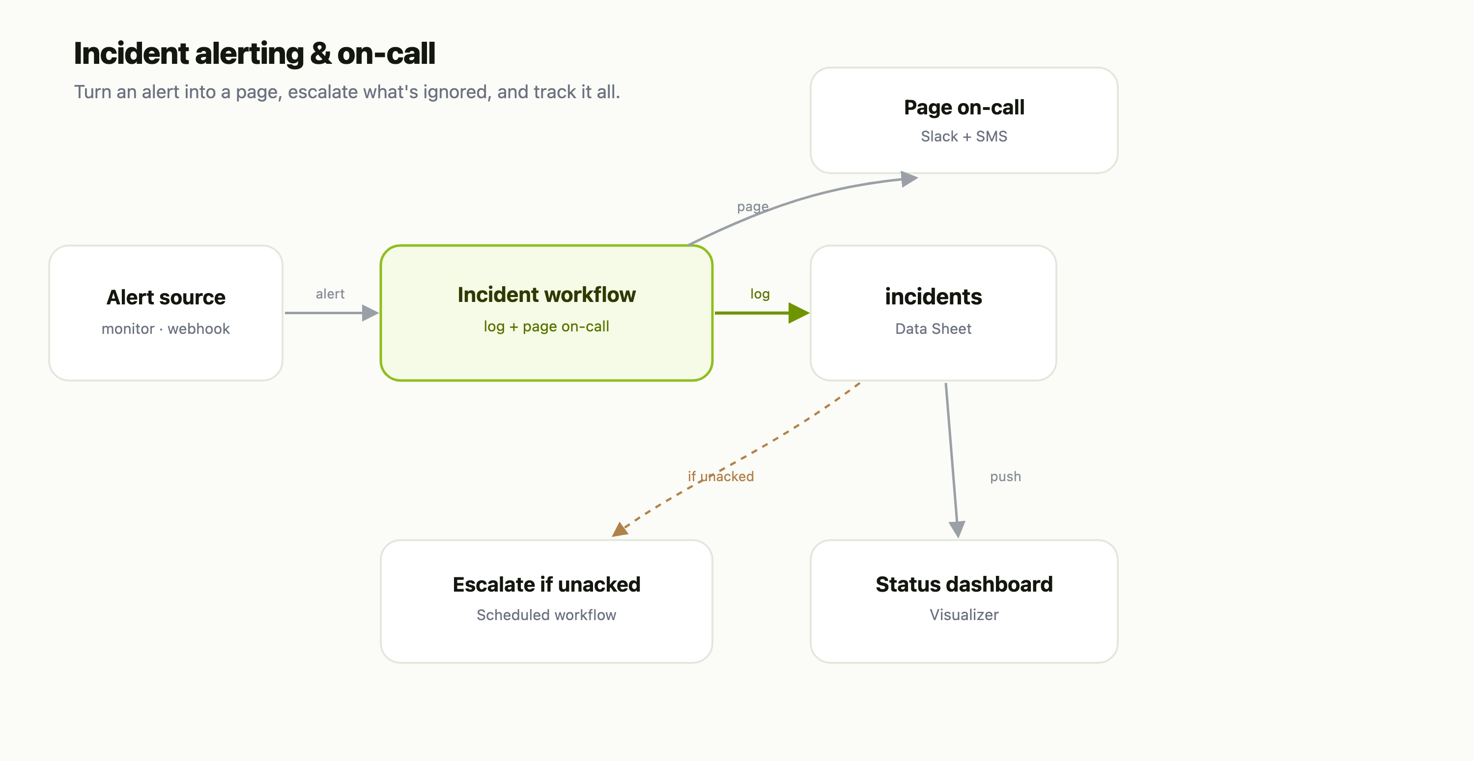

Analytics is the health check for your automation. It's built around workflow runs — how many, how often, how well — with a strip of inventory cards for everything else you own. Here's the top of the page:
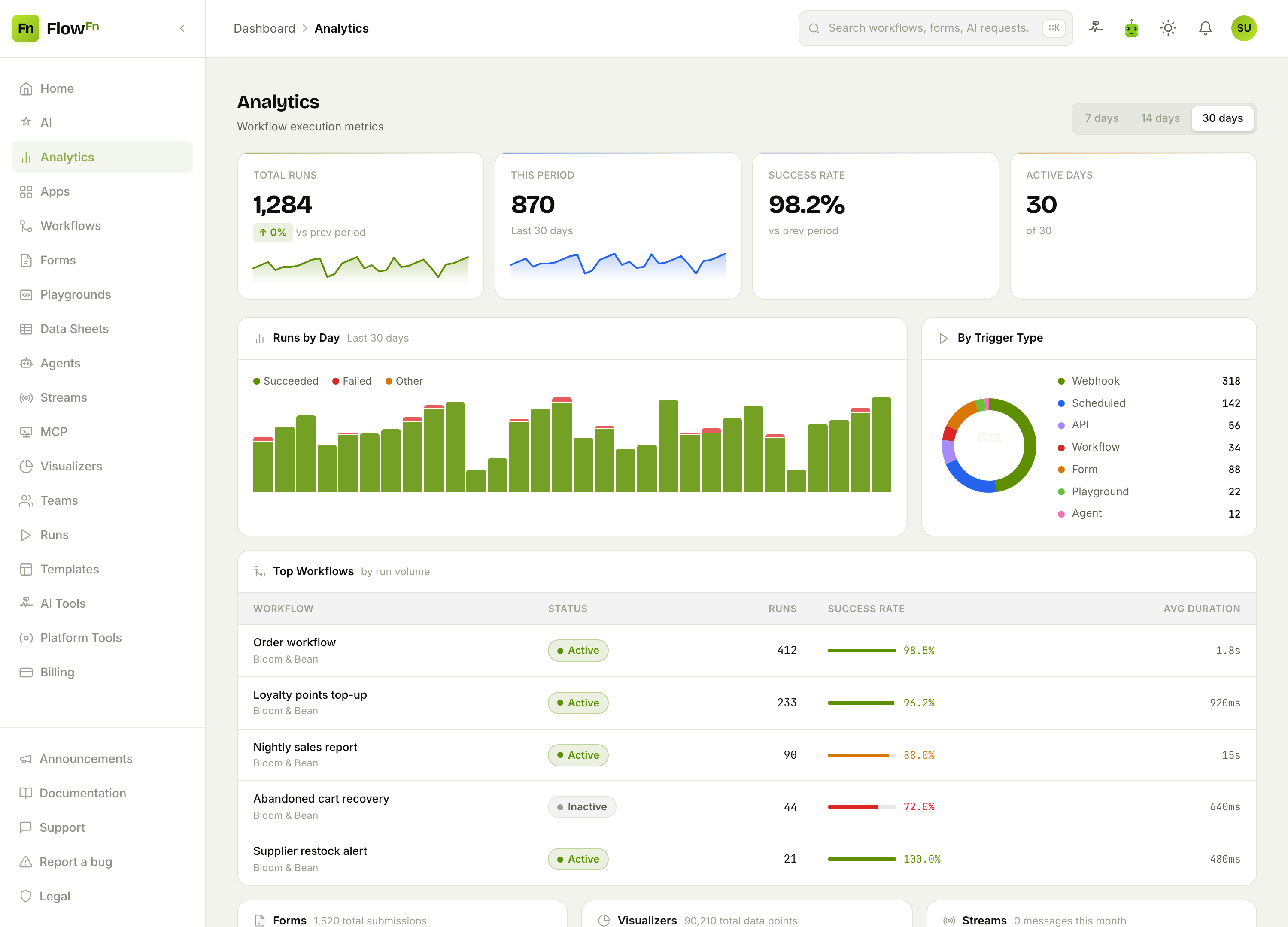
Four numbers up top, two charts below, and a range control (7 / 14 / 30 days) in the corner. Let's read it.
The vitals
The stat cards give you the one-glance summary:
- Total Runs — every run to date, with a sparkline of recent activity.
- This Period — runs in the selected window.
- Success Rate — the share that succeeded (the café's automation is running at 98.2%).
- Active Days — how many days in the window actually saw activity.
Below them, Runs by Day stacks each day's runs by outcome — Succeeded / Failed / Other — so a bad day jumps out as a red cap on a bar. Next to it, By Trigger Type breaks your runs down by what set them off: webhooks, schedules, API calls, forms, playgrounds, agents. For Bloom & Bean, most runs come from webhooks (order events) and schedules (the nightly report) — exactly what you'd expect from an ordering app.
Which workflows carry the load
The Top Workflows table ranks your workflows by run volume, with a success-rate bar and average duration for each:
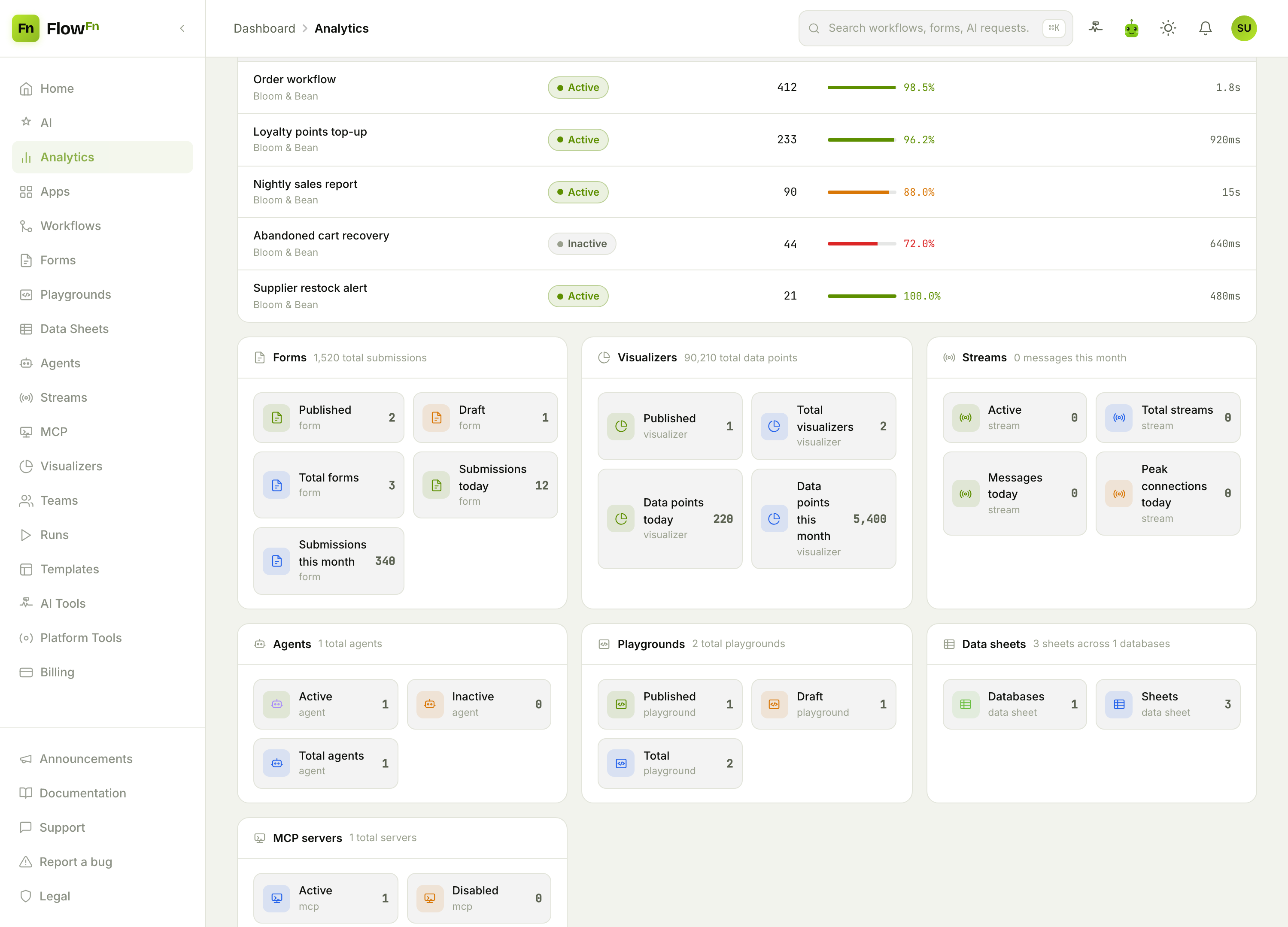
This is where problems surface. The Order workflow runs 412 times at 98.5% — healthy. But Abandoned cart recovery sits at 72% (a red bar) and is Inactive, and the Nightly sales report takes 15 seconds a run — both worth a look. The success-rate bars are color-coded (green above 95%, amber in the middle, red below 80%), so the table reads like a dashboard, not a spreadsheet.
Below the table, an inventory grid counts everything you've built — Forms (and their submissions), Visualizers (and data points), Streams, Agents, Playgrounds, Data sheets, and MCP servers — so you can see the shape of your whole workspace in one screen.
Range, scope, and access
- Range — the 7 / 14 / 30-day toggle reframes This Period, Active Days, and the Runs-by-Day chart. (Total Runs is all-time, and Success Rate is computed over the full 30 days, so those two don't shift with the toggle.)
- Scope — it's a mix. The run metrics and the Forms / Visualizers cards reflect your activity (what you created); the Streams, Agents, Playgrounds, Data sheets, and MCP cards reflect the current team's resources. Either way, there's no per-app filter.
- Access — Analytics isn't gated. It's available to every authenticated user on any plan, and the numbers simply reflect whatever runs and resources exist right now (retention windows trim very old runs, so it's a rolling picture).
Wrap-up
Analytics turns "is any of this working?" into a glance: total runs and success rate up top, a day-by-day bar chart and a trigger breakdown in the middle, your busiest (and shakiest) workflows in a ranked table, and a full inventory of everything you've built at the bottom. When a workflow's success rate dips or a job slows down, this is where you'll spot it first — then jump to Runs to see exactly which executions went wrong.
Open Analytics after your automation has run for a few days and read the Top Workflows table top to bottom — the healthy ones and the ones that need attention sort themselves. Next, we'll put you in control of the AI: bring your own key and govern which models run. Watch the numbers, and you'll know where to look before anything's on fire.